Author: Jinit Sanghvi
Introduction to ARIMA Model
A brief introduction followed by implementation

Taken from freestockcharts.com
ARIMA or Autoregressive Integrated Moving Average is a purely-regressive model and this model is used for forecasting values of a time series. A time series is essentially a sequence of data points or observations taken at different instances. Time Series are very common to find given how time-dependent most of the worldly schemes and variables are. To better understand this, take a look at the Stock Market or weather reports gathered over a timeline and you’ll observe patterns which are highly time-dependent.
In this post, we’ll first cover the theory and then move on to the code
Theory
One of the best ways to be introduced to the model is to understand why we’re using it, especially when other effective regression models like linear regression or multivariate regression exists. For time-series forecasting, why do we prefer the ARIMA model? Most of the time-series data available online focuses on the dependent variable, and how the dependent variable changes with time. For models like linear regression, we need independent variables to map a function from dependent variables to dependent variables for prediction.
However, this is not always possible because:-
- Independent Variables are not always available.
- In quite a few scenarios, too many independent variables exist and we may find it difficult to find enough dependent variables to sufficiently explain the behavior of the time-series.
On the other hand, ARIMA leverages the correlation between the values of the time-series and time, allowing it to better understand the relation between independent variables and time. Since the model focuses more on patterns and behavior of the time-series instead of finding out which factors affect these dependent variables, the model is able to forecast on the basis of these recognized patterns and behavior.
To better understand this model, let’s break it down into 2 parts and then integrate those 2 parts in the end.
AR or Autoregressive Model
The intuition behind this model is that observations at different time-steps are related to the previous value of the variable. For example, on a hot sunny day, you predict that the next day will be hotter because you’ve noticed increasing temperatures. Similarly, the AR model finds the correlation between future time-steps and past time-steps to forecast future values.
By the above equation, we can see how we can reduce this to a regression problem and statistically find the correlation between future values and earlier time-steps.
Moving Average Model
The intuition behind this model in nature is of reinforcement, i.e, a moving average model tries to learn from the previous errors it has committed and tries to tweak itself accordingly. To better understand this, take a look at the equation below:
But, what does signify? Simply put, it is the error or the difference between the actual value and the predicted value.
Since this model tries to learn from its mistakes, it is better able to account for unpredictable changes in value and is able to correct itself to provide more accurate results and predictions.
Now that you’ve understood the Autoregressive Model and the Moving Averages model, it’s time to learn about ARIMA. When the Autoregressive Terms and the Moving Average terms are combined together with differencing to make the time-series stationary(more on this later), we get the ARIMA Model! Since the equation is regressive in nature, we can find the respective weights of the terms in the equation using regression techniques.
So far, we’ve understood the basic intuition behind the ARIMA Model. Let’s dig a bit deeper and understand the parameters of an ARIMA model.
Consider a list below, and assume that every successive element of the list is a successive time-step or observation.
Now, when we difference the list, we subtract the nth value of the series with the (n-1)th value of the series. For a better understanding:
After First Differencing:
After Second Differencing:
The reason why we difference the time-series is to make the time-series stationary, i.e, the mean and the variance of the time-series remains constant/stable over time which allows us to reduce components like trend and seasonality(illustrated later). This is important because ARIMA expects the time-series to be stationary. Thus, we keep differencing the time-series till it becomes stationary.
Now that we have understood all the underlying concepts that we’re going to utilize, let’s learn how to find these parameters and dive right into the code!
To begin with, let’s start with some basic imports.
import pandas as pd
import numpy as np
import matplotlib.pyplot as plt
import seaborn as sns
import statsmodels.api as sm
plt.rcParams['axes.labelsize'] = 14
plt.rcParams['xtick.labelsize'] = 12
plt.rcParams['ytick.labelsize'] = 12
plt.rcParams['text.color'] = 'k'
from statsmodels.tsa.arima_model import ARIMA
from sklearn.metrics import mean_squared_error
%matplotlib inline
For this post, I’m going to use a time-series from the Huge Stock Market Dataset. This is just a sample time-series used to further ground the concepts you read about. At the end of this post, you’ll be able to apply these concepts to any other time-series you want to.
aus1 = pd.read_csv("a.us.txt",sep=',', index_col=0, parse_dates=True, squeeze=True)
aus1.head()
| Open | High | Low | Close | Volume | OpenInt | |
|---|---|---|---|---|---|---|
| Date | ||||||
| 1999-11-18 | 30.713 | 33.754 | 27.002 | 29.702 | 66277506 | 0 |
| 1999-11-19 | 28.986 | 29.027 | 26.872 | 27.257 | 16142920 | 0 |
| 1999-11-22 | 27.886 | 29.702 | 27.044 | 29.702 | 6970266 | 0 |
| 1999-11-23 | 28.688 | 29.446 | 27.002 | 27.002 | 6332082 | 0 |
| 1999-11-24 | 27.083 | 28.309 | 27.002 | 27.717 | 5132147 | 0 |
aus1.describe()
| Open | High | Low | Close | Volume | OpenInt | |
|---|---|---|---|---|---|---|
| count | 4521.000000 | 4521.000000 | 4521.000000 | 4521.000000 | 4.521000e+03 | 4521.0 |
| mean | 27.856296 | 28.270442 | 27.452486 | 27.871357 | 3.993503e+06 | 0.0 |
| std | 12.940880 | 13.176000 | 12.711735 | 12.944389 | 2.665730e+06 | 0.0 |
| min | 7.223100 | 7.513900 | 7.087800 | 7.323800 | 0.000000e+00 | 0.0 |
| 25% | 19.117000 | 19.435000 | 18.780000 | 19.089000 | 2.407862e+06 | 0.0 |
| 50% | 24.456000 | 24.809000 | 24.159000 | 24.490000 | 3.460621e+06 | 0.0 |
| 75% | 36.502000 | 37.046000 | 35.877000 | 36.521000 | 4.849809e+06 | 0.0 |
| max | 105.300000 | 109.370000 | 97.881000 | 107.320000 | 6.627751e+07 | 0.0 |
aus1.index
DatetimeIndex(['1999-11-18', '1999-11-19', '1999-11-22', '1999-11-23',
               '1999-11-24', '1999-11-26', '1999-11-29', '1999-11-30',
               '1999-12-01', '1999-12-02',
               ...
               '2017-10-30', '2017-10-31', '2017-11-01', '2017-11-02',
               '2017-11-03', '2017-11-06', '2017-11-07', '2017-11-08',
               '2017-11-09', '2017-11-10'],
              dtype='datetime64[ns]', name='Date', length=4521, freq=None)
Before we use this time-series, we first need to resample it into a time-series wherein each observation differs by a month.
y1 = aus1['Open'].resample('MS').mean()
y2 = aus1['Close'].resample('MS').mean()
y1.index
DatetimeIndex(['1999-11-01', '1999-12-01', '2000-01-01', '2000-02-01',
               '2000-03-01', '2000-04-01', '2000-05-01', '2000-06-01',
               '2000-07-01', '2000-08-01',
               ...
               '2017-02-01', '2017-03-01', '2017-04-01', '2017-05-01',
               '2017-06-01', '2017-07-01', '2017-08-01', '2017-09-01',
               '2017-10-01', '2017-11-01'],
              dtype='datetime64[ns]', name='Date', length=217, freq='MS')
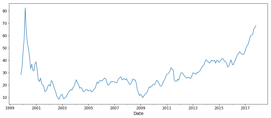
So far, so good! Let’s plot the time-series and see what it looks like!
y1.plot(figsize=(15, 6))
plt.show()
Now that we’ve seen what it looks like, let’s try breaking it down into its components. Let’s try extracting the trend, the seasonality and the residual of our time-series.
from pylab import rcParams
rcParams['figure.figsize'] = 18, 8
decomposition = sm.tsa.seasonal_decompose(y1, model='additive')
fig = decomposition.plot()
plt.show()
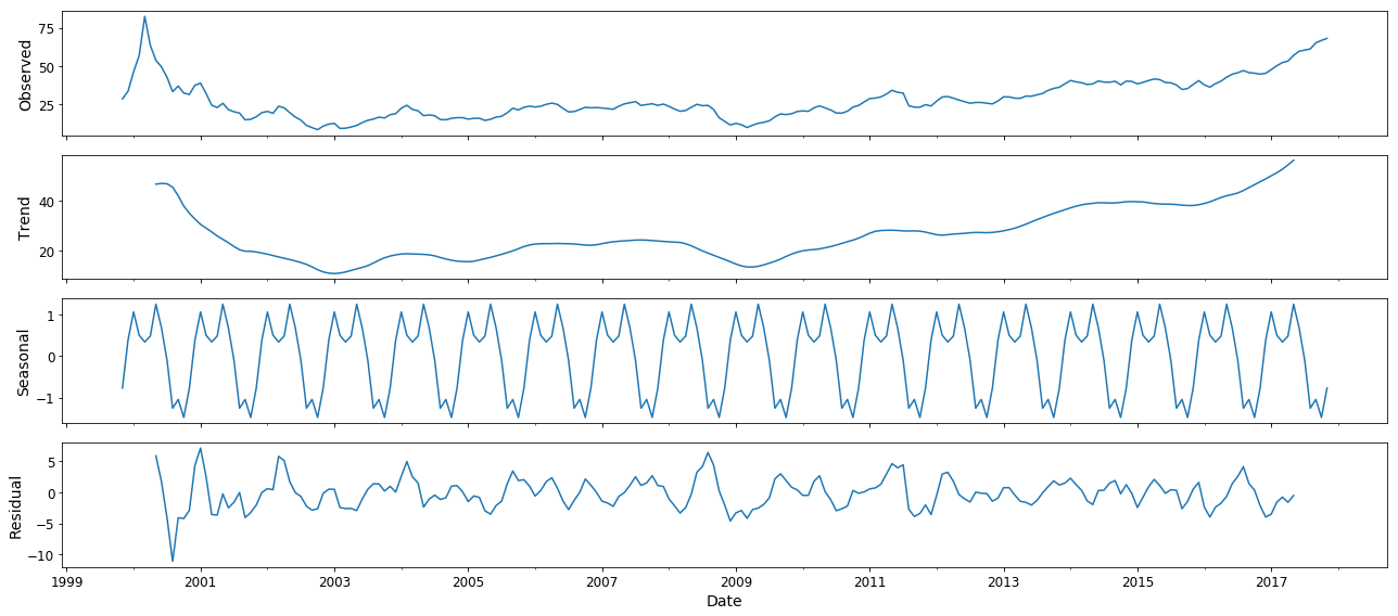
Our inference from breaking the time-series down into components like seasonality and trend is that the given time-series is not stationary. Since the trend and seasonality of the time-series affect its values at different time-steps, this time-series is not stationary as its mean and variance keeps changing. Thus, we have to difference the time-series at least once to make it stationary.
If you remember, we discussed the three parameters of the ARIMA Model. In order to determine these 3 parameters and finding the best combination of these 3 parameters in order to yield the best results, we’ll use a combination of statistical tools and iteration (trying out different models to check which achieves the best results).
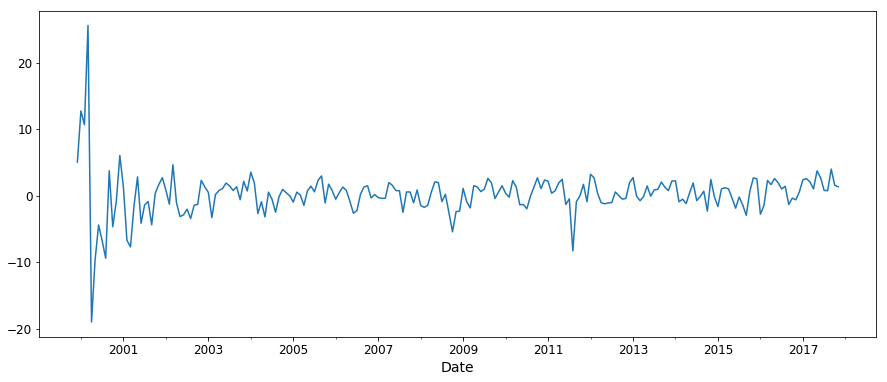
Let’s start by determining . As we mentioned earlier, we’ll keep differencing the time-series until it becomes stationary. Let’s try differencing it once and use the Augmented Dickey Fuller Test to find if it is stationary or not.
from statsmodels.tsa.stattools import adfuller
from numpy import log
y1_d = y1.diff()
y1_d = y1_d.dropna()
result = adfuller(y1_d)
print('ADF Statistic: %f' % result[0])
print('p-value: %f' % result[1])
ADF Statistic: -2.955284
p-value: 0.039287
As we see that the -value obtained is less than 0.05, we can reject the null hypothesis and say that the series is stationary. We can also see that the series has become more stationary from the plot above. Thus, obtaining a -value of less than 0.05 using ADF is a good indicator that our time-series has become stationary.
y1_d.plot(figsize=(15, 6))
plt.show()
In order to determine , we need to first understand what an ACF plot is. Autocorrelation Function plot or ACF plot shows how correlated the variable is with its previous time-steps. For example, while predicting stock prices, the ACF plot tries to show how correlated the stock prices of March are to the stock prices of February, how likely are the stock prices in March to follow the behavior of stock prices in February. To better understand this, let’s plot it.
from statsmodels.graphics.tsaplots import plot_acf,plot_pacf
plot_acf(y1_d,lags=10)

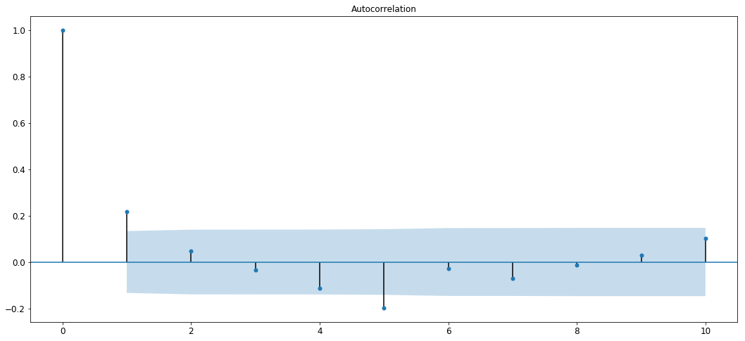
We can see that the auto-correlation is strong for the first 2 lags and then it decays and oscillates in the blue region.
Inferring from this, we can see that the first 1–2 lags show high correlation and values keep decreasing in the blue region.
Thus, we can say that the value of will lie in the range spanning from 1 to 2.
Let’s try determining now. The process of determining is very similar to the process of determining . Instead of using ACF, we’ll now use a PACF, or a Partial Autocorrelation Function. A PACF plot shows how correlated a variable is with itself at a previous time-step, ignoring all linear dependencies it has on time-steps that lie between the time-step against which correlation is to be found and the current time-step. Also called a conditional correlation fucntion, PACF aims to find the correlation between two time-steps independent of all other time-steps in between. Let’s understand this better with a plot.
plot_pacf(y1_d,lags=10)

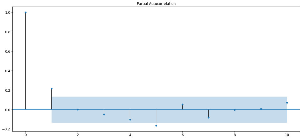
From the plot we can see that the plot cuts off to zero at the second lag so we can estimate that the value of will be lesser than 2.
Thus, we can say that the value shall lie in the range spanning from 0 to 1.
You’ve finally learnt the necessary building blocks required to create an ARIMA model in order to perform time-series forecasting! Let’s jump right into it!
We divide our time-frame into a training and a testing set so that we can later gauge how well our model is performing. Training data is 70% of the original time-series data and testing data is 30% of the original time-series data.
size = int(len(y1) * 0.7)
train, test = y1[0:size], y1[size:len(y1)]
series = [y1 for y1 in train]
predictions = []
Alright, now let’s start training the model! Let’s try using values of equal to (2,1,1) and see how the model performs!
for y in range(len(test)):
    arima_model = ARIMA(series, order=(2,1,1))
    model_fit = arima_model.fit(disp=0)
    preds = model_fit.forecast()
    pred = preds[0]
    predictions.append(pred)
    actual_val = test[y]
    series.append(actual_val)
error = mean_squared_error(test, predictions)
print('Test error is {}'.format(error))
plt.plot(predictions,'r')
plt.plot(np.array(test))
Test error is 3.273019781729989


[<matplotlib.lines.Line2D at 0x1d39598f668>]
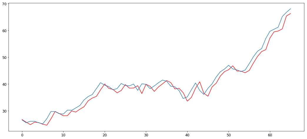
We can see that the model has learnt the nature and behavior of the time-series, and is performing pretty well on the test set!
Let’s try out new values of . Let’s try out (1,1,1) this time and see if we obtain better results.
size = int(len(y1) * 0.7)
train, test = y1[0:size], y1[size:len(y1)]
series = [y1 for y1 in train]
predictions = []
for y in range(len(test)):
    arima_model = ARIMA(series, order=(1,1,1))
    model_fit = arima_model.fit(disp=0)
    preds = model_fit.forecast()
    pred = preds[0]
    predictions.append(pred)
    actual_val = test[y]
    series.append(actual_val)
error = mean_squared_error(test, predictions)
print('Test error is {}'.format(error))
plt.plot(predictions,'r')
plt.plot(np.array(test))
Test error is 2.355571525013936


[<matplotlib.lines.Line2D at 0x1d3959f32b0>]
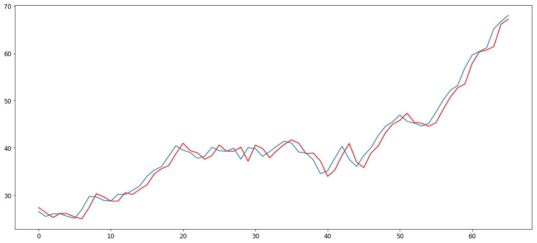
Great, we have obtained better results by changing the parameters of the model! By using the statistical methods above and by trying out different values, you can achieve great results on various different time-series.
I hope you’re now acquainted with various concepts of Time-Series Forecasting and the ARIMA Model!
You can get the jupyter notebook corresponding to this blog here